
> Bio-engineering & bioinformatics pipelines > Protein Language Modeling > Activate Insights: Visualizing Predicted Protein Sequences & Mutations with Python
Activate Insights: Visualizing Predicted Protein Sequences & Mutations with Python
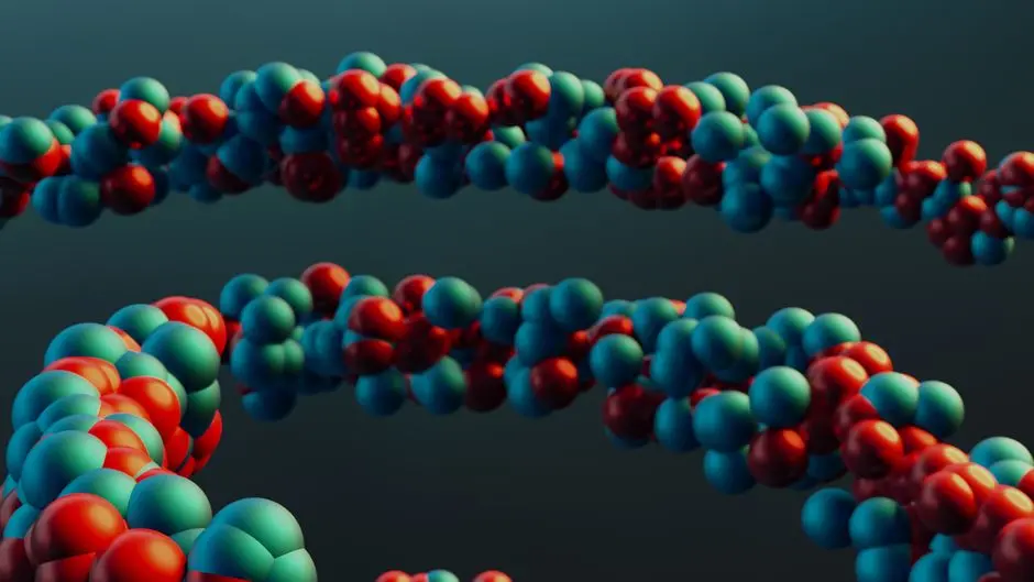
Unlock the intricate world of protein evolution and design. As protein language models (PLMs) generate increasingly sophisticated predictions, deciphering their output becomes paramount. We stand at a frontier where understanding predicted sequences and their associated mutation probabilities directly empowers biological engineering and drug discovery. This resource activates your capacity to transform raw data into compelling visual narratives, revealing hidden patterns of protein behavior and potential. Imagine pinpointing critical residues for stability or engineering novel functions; visual analytics makes this a tangible reality. We elevate your ability to leverage advanced AI models, specifically those that allow us to use Transformers and AI to model protein sequences and embeddings, by providing the essential toolkit for interpreting their outputs effectively. This guide engineers a pathway for you to confidently plot, analyze, and communicate the complex insights derived from your protein modeling endeavors, empowering decisive action in the lab and beyond.
Forge Data Foundations: Preparing Predicted Sequences and Probabilities
Before we activate any visualization, we must meticulously prepare our data. Protein Language Models (PLMs) generate outputs in various forms: raw token probabilities, logits for amino acid residues, or directly predicted sequences. Our objective is to consolidate these into structured formats that facilitate plotting. We specifically target two key data types: the predicted amino acid sequence and a matrix of mutation probabilities. The predicted sequence represents the most likely protein variant based on the model's inference, while the mutation probability matrix quantifies the likelihood of each potential amino acid substitution at every position along the sequence.
We initiate this process by defining a reference, typically the wild-type sequence, against which we compare predictions. The predicted sequence emerges from the PLM's decoding process. Crucially, the mutation probability matrix, often derived from the softmax output of the model's final layer, presents a formidable dataset. Each row corresponds to a position in the protein, and each column represents one of the 20 standard amino acids, with cell values indicating the probability of that amino acid occurring at that specific position. This data structure immediately reveals potential hotspots of variability or conservation. Our Python code forges a mock dataset, simulating these outputs, ensuring a reproducible foundation for our visualization journey. It generates a wild-type sequence, a slightly altered predicted sequence, and a corresponding mutation probability DataFrame. This preparatory step is not merely data wrangling; it is the strategic establishment of a robust data pipeline, directly influencing the accuracy and interpretability of all subsequent visualizations. We ensure that our data is clean, well-organized, and primed for insightful analysis.
# Python code to generate mock predicted sequences and mutation probability matrices
import numpy as np
import pandas as pd

def generate_mock_protein_data(length=100, num_aa_types=20, wild_type_sequence=None):
    """
    Generates mock protein data: wild-type sequence, predicted sequence,
    and a mutation probability matrix.
    """
    amino_acids = 'ACDEFGHIKLMNPQRSTVWY'
    if wild_type_sequence is None:
        wild_type_sequence = ''.join(np.random.choice(list(amino_acids), length))

    # Simulate a predicted sequence with some mutations
    predicted_sequence_list = list(wild_type_sequence)
    num_mutations = np.random.randint(5, 15) # Random number of mutations
    mutation_indices = np.random.choice(length, num_mutations, replace=False)
    for idx in mutation_indices:
        original_aa = predicted_sequence_list[idx]
        possible_mutations = [aa for aa in amino_acids if aa != original_aa]
        predicted_sequence_list[idx] = np.random.choice(possible_mutations)
    predicted_sequence = ''.join(predicted_sequence_list)

    # Simulate mutation probability matrix (position x AA type)
    # Each row sums to 1 (probability of changing TO a specific AA at that position)
    mutation_probabilities = np.random.rand(length, num_aa_types)
    mutation_probabilities = mutation_probabilities / mutation_probabilities.sum(axis=1, keepdims=True)

    # Create a DataFrame for mutation probabilities for easier handling
    mutation_df = pd.DataFrame(
        mutation_probabilities,
        columns=list(amino_acids),
        index=[f'Pos_{i+1}' for i in range(length)]
    )

    print(f"Wild-type Sequence: {wild_type_sequence}")
    print(f"Predicted Sequence: {predicted_sequence}")
    print(f"Mutation Probabilities (first 5 positions):
{mutation_df.head()}")

    return wild_type_sequence, predicted_sequence, mutation_df

# --- EXECUTION ---
# Define a custom wild-type sequence for reproducibility or use None for random
custom_wt = "MVLSPADKTNVKAAWGKVGAHAGEYGAEALERMFLSFPTTKTYFPHFDLSHGSAQVKGHGKKVADALTNAVAHVDDMPNALSALSDLLHAHKLRVDPVNFKLLSHCLLVTLAAHLPAEFTPAVHASLDKFLASVSTVLTSKYR"

wild_type, predicted_seq, mutation_probs_df = generate_mock_protein_data(
    length=len(custom_wt),
    wild_type_sequence=custom_wt
)

# Save data for subsequent steps (optional, can pass variables directly)
# np.save('mutation_probabilities.npy', mutation_probs_df.values)
# with open('wild_type_sequence.txt', 'w') as f: f.write(wild_type)
# with open('predicted_sequence.txt', 'w') as f: f.write(predicted_seq)
Decode Sequence Evolution: Visualizing Predicted Substitutions
Decoding the evolutionary trajectory of a protein sequence demands a clear visualization of changes. When a PLM predicts a new sequence, comparing it directly to the wild-type reference reveals the specific amino acid substitutions. This visualization is not merely cosmetic; it is a critical step in understanding how a protein might have adapted, acquired new functions, or been impacted by a genetic alteration. We activate this insight by developing plots that prominently highlight these divergences.
Our strategy centers on a position-by-position comparison. For each residue, we identify if the predicted amino acid differs from the wild-type. Visualizing these differences can take many forms, from simple text-based comparisons to more sophisticated graphical representations. For instance, a sequence logo can illustrate enriched amino acids at specific positions, but for direct comparison of two sequences, a plot that overlays or juxtaposes them is often more direct. We employ Python's Matplotlib to engineer a visual representation where the wild-type and predicted sequences are displayed, with mutated residues explicitly marked and colored. This surgical approach immediately draws the eye to sites of variation, allowing for rapid identification of potential functional shifts or structural implications. This visualization acts as a roadmap, guiding further investigation into why certain residues are prone to mutation and what impact these changes exert on the protein's overall fitness. This process is indispensable for targeted protein engineering, guiding rational design efforts by illuminating the exact points of divergence the model suggests. We transform abstract sequence data into an actionable blueprint for biological discovery.
# Python code to visualize differences between wild-type and predicted sequences
import matplotlib.pyplot as plt
import numpy as np

def visualize_sequence_differences(wild_type_seq, predicted_seq):
    """
    Visualizes differences between two protein sequences.
    Highlights differing amino acids.
    """
    if len(wild_type_seq) != len(predicted_seq):
        raise ValueError("Sequences must be of the same length for comparison.")

    length = len(wild_type_seq)
    differences = []
    for i in range(length):
        if wild_type_seq[i] != predicted_seq[i]:
            differences.append(i) # Store index of difference

    # Create a simple plot to highlight differences
    fig, ax = plt.subplots(figsize=(max(15, length / 5), 3))

    # Plot wild-type sequence
    ax.text(0, 1.5, 'Wild-type:', va='center', ha='right', fontsize=12)
    for i, aa in enumerate(wild_type_seq):
        ax.text(i, 1.5, aa, va='center', ha='center', fontsize=10, color='black')

    # Plot predicted sequence
    ax.text(0, 0.5, 'Predicted:', va='center', ha='right', fontsize=12)
    for i, aa in enumerate(predicted_seq):
        color = 'red' if i in differences else 'black'
        ax.text(i, 0.5, aa, va='center', ha='center', fontsize=10, color=color, fontweight='bold' if i in differences else 'normal')
        if i in differences:
            # Add a small marker or box around the differing residue
            ax.plot(i, 0.5, 'o', color='red', markersize=8, alpha=0.3)

    ax.set_xlim(-1, length)
    ax.set_ylim(0, 2)
    ax.axis('off') # Hide axes
    ax.set_title('Predicted Sequence vs. Wild-type: Mutations Highlighted', fontsize=14)
    plt.tight_layout()
    plt.show()

    print(f"Found {len(differences)} differences at positions (0-indexed): {differences}")

# --- EXECUTION ---
# Use the data generated in the previous step
# wild_type, predicted_seq = 'MVLSPADKT...', 'MVLSKADKT...'
# For demonstration, ensure these variables are available from the previous run

visualize_sequence_differences(wild_type, predicted_seq)

Map Mutational Landscapes: Heatmaps of Probability Distributions
Mapping the mutational landscape of a protein is akin to charting a biological frontier. Heatmaps serve as powerful instruments for this exploration, providing a macroscopic view of mutation probabilities across the entire protein sequence. These visualizations decode complex probability distributions, instantly revealing 'hotspots' – positions where the protein language model predicts a high likelihood of amino acid substitution – and conserved regions where variability is low. A heatmap's intensity, typically represented by color gradients, directly correlates with the probability of a given amino acid appearing at a specific position.
We construct these maps using Python libraries like Seaborn and Matplotlib. Each row of the heatmap typically represents a different amino acid type, and each column corresponds to a position in the protein sequence. This arrangement allows for intuitive interpretation: we scan horizontally to understand the probability distribution of amino acids at a single site, or vertically to observe how the probability of a specific amino acid changes along the entire sequence. This detailed view is invaluable for identifying residues critical for protein stability, binding interfaces, or catalytic activity. High-probability mutations in these regions signal potential functional alterations. Conversely, regions displaying low variability and strong conservation underscore essential structural or functional integrity. This surgical visualization strategy informs rational protein design, guiding researchers to target or preserve specific sites with precision. We transform abstract probability matrices into an electrifying visual guide, empowering you to navigate the protein's mutational potential with clarity and foresight.
# Python code to generate a heatmap of mutation probabilities
import matplotlib.pyplot as plt
import seaborn as sns
import pandas as pd

def visualize_mutation_heatmap(mutation_df, title="Mutation Probability Heatmap", top_n_aa=20):
    """
    Generates a heatmap of mutation probabilities across sequence positions
    and amino acid types.
    """
    amino_acids = 'ACDEFGHIKLMNPQRSTVWY'
    # Ensure amino acids are in the correct order for consistent plotting
    plot_df = mutation_df.loc[:, [aa for aa in amino_acids if aa in mutation_df.columns]]

    plt.figure(figsize=(max(15, len(mutation_df)/5), 10)) # Adjust figure size dynamically
    sns.heatmap(
        plot_df.T, # Transpose to have AA types on y-axis, positions on x-axis
        cmap='viridis', # Choose a suitable colormap (e.g., 'viridis', 'plasma', 'rocket')
        linewidths=.5,
        linecolor='lightgray',
        cbar_kws={'label': 'Probability'},
        yticklabels=True, # Show AA labels on y-axis
        xticklabels=10 # Show every 10th position label for readability
    )
    plt.title(title, fontsize=16)
    plt.xlabel('Protein Position', fontsize=12)
    plt.ylabel('Amino Acid Type', fontsize=12)
    plt.yticks(rotation=0) # Keep AA labels horizontal
    plt.tight_layout()
    plt.show()

# --- EXECUTION ---
# Use the mutation_probs_df generated in the first step
# mutation_probs_df = pd.DataFrame(...)

visualize_mutation_heatmap(mutation_probs_df, title="Predicted Amino Acid Probability Across Sequence Positions")
Engineer Targeted Change: Advanced Visualization of Key Mutations
Our ultimate goal in protein engineering is to activate targeted changes. Moving beyond general patterns, we surgically focus on specific mutations with the highest predicted impact. This requires filtering the vast mutational landscape to pinpoint critical sites. Advanced visualization techniques allow us to highlight these 'actionable' mutations, providing a direct roadmap for experimental design. We correlate high mutation probabilities with positions that hold significant functional or structural leverage, transforming raw predictions into concrete engineering targets.
We decode the most impactful mutations by setting a probability threshold. Any position where the most likely non-wild-type amino acid substitution exceeds this threshold warrants closer inspection. Our Python code identifies these high-impact positions, extracting not just the position itself, but also the wild-type residue and the most probable substituting amino acid, along with its associated probability. We then create targeted plots, such as bar charts, to graphically represent these selected sites. Each bar signifies a specific mutation, with its height corresponding to the probability of that substitution. The labels clearly indicate the position and the amino acid change (e.g., "Pos 52: G->A"). This focused visualization strategy ensures that researchers are not overwhelmed by data but are instead guided directly to the most promising avenues for protein optimization or functional alteration. By prioritizing and visualizing these key mutations, we empower biologists and bio-engineers to make precise, data-driven decisions, accelerating the design of novel proteins and therapeutic agents. This is where computational biology transitions from observation to deliberate action, engineering biological systems with unparalleled precision.
# Python code to highlight key mutations based on probability thresholds
import matplotlib.pyplot as plt
import pandas as pd
import numpy as np

def visualize_key_mutations(wild_type_seq, mutation_df, threshold=0.3, num_top_mutations=10):
    """
    Identifies and visualizes key mutation sites based on a probability threshold
    and highlights the most likely substitution.
    """
    amino_acids = list('ACDEFGHIKLMNPQRSTVWY')

    # Calculate entropy or variance to find positions with high uncertainty/potential for change
    # For simplicity, let's identify positions where the max probability for *any* AA (other than WT) is high.

    # Find the wild-type AA at each position from the wild_type_seq
    wt_aas_at_pos = [wild_type_seq[i] for i in range(len(wild_type_seq))]

    # For each position, find the highest probability for a *non-wild-type* amino acid
    max_mutation_probs = []
    most_likely_mutations = []
    for i, wt_aa in enumerate(wt_aas_at_pos):
        row_probs = mutation_df.iloc[i].copy() # Get probabilities for current position
        if wt_aa in row_probs.index: # If WT AA is in our AA list, exclude its prob for 'mutation' analysis
            row_probs[wt_aa] = 0 # Set WT AA probability to 0 to find highest *mutation* prob

        max_prob_for_pos = row_probs.max() # Max probability among non-WT AAs
        most_likely_aa = row_probs.idxmax() if max_prob_for_pos > 0 else wt_aa # If no mutation prob > 0, default to WT

        max_mutation_probs.append(max_prob_for_pos)
        most_likely_mutations.append(most_likely_aa)

    # Filter positions based on threshold
    high_impact_positions = []
    for i, prob in enumerate(max_mutation_probs):
        if prob >= threshold:
            high_impact_positions.append({
                'position': i + 1, # 1-indexed
                'wild_type_aa': wt_aas_at_pos[i],
                'predicted_aa': most_likely_mutations[i],
                'probability': prob
            })

    # Sort by probability descending and take top N
    high_impact_positions_sorted = sorted(high_impact_positions, key=lambda x: x['probability'], reverse=True)[:num_top_mutations]

    if not high_impact_positions_sorted:
        print("No high-impact mutations found above the given threshold.")
        return

    # Plotting the top mutations
    positions = [d['position'] for d in high_impact_positions_sorted]
    probabilities = [d['probability'] for d in high_impact_positions_sorted]
    labels = [f"Pos {d['position']}: {d['wild_type_aa']}->{d['predicted_aa']}" for d in high_impact_positions_sorted]

    fig, ax = plt.subplots(figsize=(12, 6))
    bars = ax.bar(range(len(positions)), probabilities, color='skyblue')
    ax.set_xticks(range(len(positions)))
    ax.set_xticklabels(labels, rotation=45, ha='right')
    ax.set_ylabel('Probability of Most Likely Mutation')
    ax.set_title(f'Top {len(high_impact_positions_sorted)} High-Impact Mutation Sites (Probability > {threshold})')
    ax.set_ylim(0, 1)

    for bar in bars:
        yval = bar.get_height()
        ax.text(bar.get_x() + bar.get_width()/2, yval + 0.02, round(yval, 2), ha='center', va='bottom', fontsize=9)

    plt.tight_layout()
    plt.show()

    print("\nHigh-Impact Mutations Detected:")
    for h_imp in high_impact_positions_sorted:
        print(f" - Position {h_imp['position']} (Wild-type: {h_imp['wild_type_aa']}): "
              f"Most likely mutation to {h_imp['predicted_aa']} (Probability: {h_imp['probability']:.2f})")


# --- EXECUTION ---
# Use wild_type and mutation_probs_df from previous steps
# wild_type = 'MVLSPADKT...'
# mutation_probs_df = pd.DataFrame(...)

visualize_key_mutations(wild_type, mutation_probs_df, threshold=0.15, num_top_mutations=15)
Key Takeaways
Mastering Protein Data Preparation
Activate clean, structured data: Before any visualization, meticulously prepare protein data from Language Models. Focus on two critical outputs: the predicted amino acid sequence and the mutation probability matrix (position x AA type). Utilize libraries like NumPy and Pandas to structure this data, ensuring clarity and readiness for analysis. This foundational step is non-negotiable for accurate insights.
Decoding Sequence Differences
Forge insights into evolutionary changes: Compare predicted protein sequences against wild-type references. Use visualization tools, like Matplotlib, to graphically highlight specific amino acid substitutions. This direct visual comparison pinpoints sites of variation, offering immediate clues about potential functional shifts or structural implications, guiding precise experimental targeting.
Mapping Mutational Landscapes with Heatmaps
Chart the protein frontier: Employ heatmaps (via Seaborn and Matplotlib) to visualize the entire mutation probability matrix. This macroscopic view instantly reveals 'hotspots' – positions with high substitution likelihood – and highly conserved regions. Interpreting these maps helps identify critical residues for stability, function, or binding, transforming abstract probabilities into an actionable guide for protein optimization.
Targeting Key Mutations for Engineering
Engineer specific changes with precision: Move beyond general trends to identify and visualize high-impact mutations. Set probability thresholds to filter out less significant changes, focusing on sites with the greatest potential for functional alteration. Use targeted plots, such as bar charts, to clearly present these key mutations (position, wild-type, most likely substitution, probability), providing a direct blueprint for rational protein design and accelerating biological discovery.
FAQ
-
Why is visualizing predicted protein sequences and mutations critical?
Visualizing predicted protein sequences and mutations is critical for
transforming abstract computational outputs into actionable biological insights . It empowers researchers to:- Quickly identify key differences: Pinpoint specific amino acid changes between a wild-type and a predicted sequence.
- Reveal mutational hotspots: Understand which regions or residues are most prone to variation according to the model.
- Guide experimental design: Target specific sites for mutagenesis experiments, rational protein design, or drug development.
- Interpret model behavior: Gain intuition into what a protein language model has learned about protein evolution and function.
- Communicate complex data: Present intricate data in an easily digestible and impactful format for collaboration and publication.
Without effective visualization, the vast amounts of data generated by modern protein models remain largely untapped, hindering progress in bio-engineering and basic science.
-
What Python libraries are most effective for these visualizations?
To forge robust and insightful visualizations of protein sequences and mutations, we rely on a powerful suite of Python libraries:
- Matplotlib: The foundational plotting library, indispensable for creating static, interactive, and animated visualizations in Python. It provides fine-grained control over every aspect of a plot.
- Seaborn: Built on Matplotlib, Seaborn offers a higher-level interface for drawing attractive and informative statistical graphics. It excels at creating heatmaps, which are perfect for visualizing mutation probability matrices, and streamlining complex data representations.
- NumPy: Essential for numerical operations, especially when handling large arrays of probabilities or sequence data. It underpins the data manipulation necessary before visualization.
- Pandas: Crucial for data structuring and analysis. It facilitates working with tabular data (DataFrames) like our mutation probability matrices, making data preparation and filtering intuitive and efficient.
Together, these libraries empower us to decode complex biological data into clear, actionable visual narratives.
-
What are common pitfalls when interpreting mutation probability heatmaps?
Interpreting mutation probability heatmaps demands a surgical approach to avoid common pitfalls:
- Over-interpretation of subtle differences: Small probability variations may not be biologically significant. Focus on distinct hotspots or trends.
- Ignoring context: A high mutation probability at a specific site does not automatically imply a functional change. Always consider structural context, protein domain information, and known functional sites.
- Bias in training data: The model's predictions reflect the biases and limitations of its training data. If rare or unusual mutations were underrepresented, the model might not accurately predict their probabilities.
- Absolute vs. relative probabilities: Differentiate between the absolute probability of a mutation and its probability relative to other possible substitutions at that position. Sometimes, even low absolute probabilities can be significant if they are the highest among alternatives.
- Lack of experimental validation: Predicted mutations are hypotheses. They always require experimental validation to confirm their real-world impact on protein function, stability, or interactions. The heatmap guides, but the lab confirms.
We approach these visualizations as powerful guides, not definitive answers, always integrating them with a deep understanding of protein biology.