
> Bio-engineering & bioinformatics pipelines > Protein Language Modeling > Unveil Protein Predictions: Python & R Visualization Guide
Unveil Protein Predictions: Python & R Visualization Guide
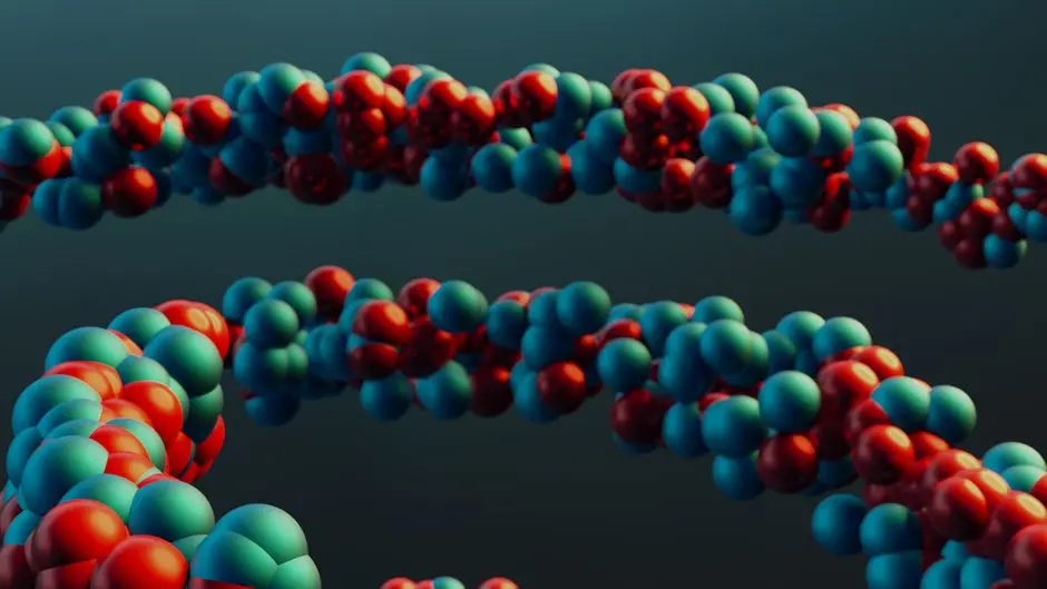
Unlock the profound insights hidden within protein language models. We forge a pathway to visually manifest embedding-driven predictions, empowering researchers and engineers to decode complex biological functions with unparalleled clarity. This definitive resource activates your capacity to transform raw data into compelling narratives, revealing critical patterns in protein structure, function, and interaction.
Harnessing the predictive power of advanced AI models demands sophisticated visualization. We bridge the gap between abstract embedding spaces and tangible biological insights. This guide is your blueprint for constructing high-impact visualizations in both Python and R, offering a surgical approach to plot design and interpretation. Prepare to master the art of data storytelling, propelling your understanding of protein biology forward. The journey to accurately model protein sequences and embeddings using advanced AI culminates in effective visualization, which this article meticulously details.
Architecting Your Visualization Pipeline for Protein Embeddings
Forging a robust visualization pipeline for protein embedding predictions commences with meticulous data preparation. We advocate for a systematic approach, ensuring every dataset is primed for maximum analytical yield. First, activate the extraction of protein embeddings from your chosen language model. These high-dimensional vectors encapsulate the intricate biophysical and biochemical properties of proteins. Concurrently, gather your prediction outputs—be it classifications (e.g., functional annotations), regressions (e.g., binding affinities), or complex structural inferences.
We define clear visualization objectives upfront. Are we dissecting distinct protein clusters based on predicted classes? Are we correlating embedding proximity with quantitative prediction scores? Each objective dictates the optimal visualization strategy. Crucially, we prepare our data by aligning embeddings with their corresponding predictions. This often involves merging dataframes or creating structured objects that retain protein identifiers, embedding vectors, and all associated metadata. This foundational step is non-negotiable for coherent analysis. Neglecting this crucial alignment renders subsequent visualizations ambiguous. Employ Python's Pandas for efficient data manipulation and R's dplyr for similar data wrangling, mastering these tools ensures data integrity from the outset.
# Python setup
import numpy as np
import pandas as pd
import matplotlib.pyplot as plt
import seaborn as sns
from sklearn.decomposition import PCA
from sklearn.manifold import TSNE
import umap.umap_ as umap # pip install umap-learn

# R setup - run in R console or an R environment like RStudio
# install.packages(c("ggplot2", "Rtsne", "uwot", "dplyr"))

# Simulate loading protein embeddings (e.g., from a .npy or .csv file)
# In a real scenario, embeddings would come from a pre-trained protein language model
def load_simulated_data(num_proteins=100, embedding_dim=512):
    np.random.seed(42)
    embeddings = np.random.rand(num_proteins, embedding_dim)
    # Simulate a binary prediction task (e.g., active/inactive, soluble/insoluble)
    predictions = np.random.choice([0, 1], size=num_proteins)
    # Simulate a continuous prediction task (e.g., binding affinity, stability score)
    continuous_predictions = np.random.rand(num_proteins) * 100

    df_data = pd.DataFrame({
        'protein_id': [f'protein_{i}' for i in range(num_proteins)],
        'embedding': list(embeddings),
        'predicted_class': ['Class A' if p == 0 else 'Class B' for p in predictions],
        'predicted_score': continuous_predictions
    })
    return df_data, embeddings

# Activate the data loading
data_df, embeddings_matrix = load_simulated_data()
print("Simulated Data Head (Python):")
print(data_df.head())
print(f"Embeddings matrix shape: {embeddings_matrix.shape}")


# R code for loading/preparing data (conceptually, would be run in R)
# # R code block start
# library(ggplot2)
# library(Rtsne)
# library(uwot)
# library(dplyr)

# # Simulate loading protein embeddings and predictions
# # In R, you might load from a CSV or directly from a Python script output
# set.seed(42)
# num_proteins <- 100
# embedding_dim <- 512
#
# # Create simulated embeddings and predictions
# embeddings_r <- matrix(runif(num_proteins * embedding_dim), ncol = embedding_dim)
# predicted_class_r <- sample(c("Class A", "Class B"), num_proteins, replace = TRUE)
# predicted_score_r <- runif(num_proteins, min = 0, max = 100)
#
# # Combine into a data frame
# protein_data_r <- data.frame(
#   protein_id = paste0("protein_", 1:num_proteins),
#   predicted_class = predicted_class_r,
#   predicted_score = predicted_score_r
# )
#
# # Attach embeddings (for conceptual representation)
# # In a real scenario, you'd perform dimensionality reduction directly on `embeddings_r`
# # and add the reduced dimensions to `protein_data_r`
#
# print("Simulated Data Head (R):")
# print(head(protein_data_r))
# print(paste("Embeddings matrix dimensions (R):", dim(embeddings_r)[1], "x", dim(embeddings_r)[2]))
# # R code block end

Pythonic Pathways to Insight: Static and Interactive Visualizations
We activate Python's robust visualization ecosystem to translate complex protein embedding spaces into actionable insights. Employing dimensionality reduction techniques like PCA (Principal Component Analysis), t-SNE (t-Distributed Stochastic Neighbor Embedding), and UMAP (Uniform Manifold Approximation and Projection) is paramount. PCA provides a linear projection, ideal for identifying major variances, while t-SNE and UMAP excel at preserving local structures, revealing distinct clusters of proteins. We orchestrate these transformations with scikit-learn and umap-learn.
Forge compelling static plots with Matplotlib and Seaborn. Visualize predicted classes by coloring data points in reduced-dimension plots. For continuous predictions, map scores to color gradients or marker sizes, crafting heatmaps or scatter plots that reveal trends across the embedding landscape. A common error is over-interpreting spatial relationships in t-SNE/UMAP plots as direct distances; these plots prioritize neighborhood preservation, not absolute distance. For dynamic exploration, leverage Plotly Express. Interactive plots empower deep dives into individual protein characteristics, displaying metadata on hover, facilitating rapid identification of outliers or functionally similar groups. This interactivity unlocks a higher dimension of data exploration, allowing immediate validation of hypotheses and discovery of hidden biological leverage points.
# Python code for dimensionality reduction and plotting

# 1. PCA for initial overview
# Component count should be <= min(num_samples, num_features)
num_components = min(embeddings_matrix.shape[0], embeddings_matrix.shape[1], 50) # Limit components for small datasets
pca = PCA(n_components=min(2, num_components))
pca_result = pca.fit_transform(embeddings_matrix)

data_df['pca_1'] = pca_result[:, 0]
data_df['pca_2'] = pca_result[:, 1]

plt.figure(figsize=(10, 8))
sns.scatterplot(
    x='pca_1',
    y='pca_2',
    hue='predicted_class', # Color by predicted class
    palette=sns.color_palette('tab10', n_colors=len(data_df['predicted_class'].unique())),
    data=data_df,
    legend='full',
    alpha=0.8
)
plt.title('PCA of Protein Embeddings Colored by Predicted Class')
plt.xlabel('Principal Component 1')
plt.ylabel('Principal Component 2')
plt.grid(True, linestyle='--', alpha=0.6)
plt.tight_layout()
plt.show()

# 2. UMAP for better cluster separation (often)
# Adjust n_neighbors and min_dist for desired balance between local and global structure
umap_reducer = umap.UMAP(n_neighbors=15, min_dist=0.1, n_components=2, random_state=42)
umap_result = umap_reducer.fit_transform(embeddings_matrix)

data_df['umap_1'] = umap_result[:, 0]
data_df['umap_2'] = umap_result[:, 1]

plt.figure(figsize=(10, 8))
sns.scatterplot(
    x='umap_1',
    y='umap_2',
    hue='predicted_class',
    palette=sns.color_palette('viridis', n_colors=len(data_df['predicted_class'].unique())),
    data=data_df,
    legend='full',
    alpha=0.8
)
plt.title('UMAP of Protein Embeddings Colored by Predicted Class')
plt.xlabel('UMAP Component 1')
plt.ylabel('UMAP Component 2')
plt.grid(True, linestyle='--', alpha=0.6)
plt.tight_layout()
plt.show()

# 3. Visualizing Continuous Predictions with a Heatmap/Scatterplot
plt.figure(figsize=(12, 6))
sns.histplot(data_df, x='predicted_score', bins=20, kde=True, color='skyblue')
plt.title('Distribution of Predicted Scores')
plt.xlabel('Predicted Score')
plt.ylabel('Frequency')
plt.grid(True, linestyle='--', alpha=0.6)
plt.tight_layout()
plt.show()

# Scatter plot of PCA/UMAP vs. continuous score (example with PCA)
plt.figure(figsize=(10, 8))
scatter_plot = sns.scatterplot(
    x='pca_1',
    y='pca_2',
    hue='predicted_score',
    size='predicted_score', # Use size to indicate score magnitude
    palette='coolwarm', # A diverging colormap is often good for scores
    sizes=(20, 400), # Range of marker sizes
    data=data_df,
    legend='full',
    alpha=0.7
)
plt.title('PCA of Protein Embeddings Colored and Sized by Predicted Score')
plt.xlabel('Principal Component 1')
plt.ylabel('Principal Component 2')
plt.grid(True, linestyle='--', alpha=0.6)
plt.tight_layout()
plt.show()

# For interactive plots with Plotly, install plotly and kaleido (for static export)
# import plotly.express as px
#
# fig = px.scatter(
#     data_df,
#     x='umap_1',
#     y='umap_2',
#     color='predicted_class',
#     hover_name='protein_id',
#     title='Interactive UMAP of Protein Embeddings (Plotly)',
#     labels={'umap_1': 'UMAP Component 1', 'umap_2': 'UMAP Component 2'}
# )
# fig.show()
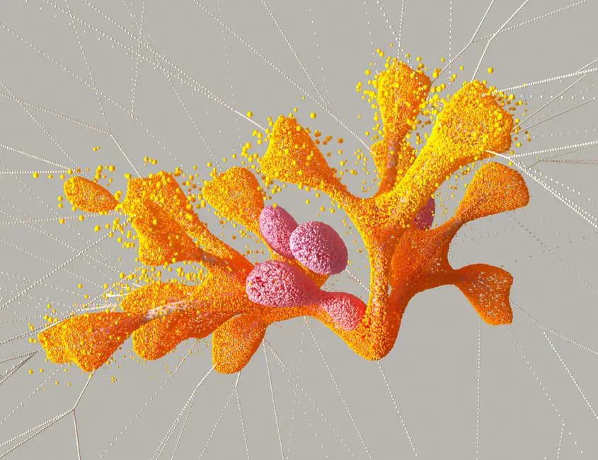
R-Powered Revelation: Crafting Elegant Prediction Landscapes
We activate R's unparalleled statistical graphing capabilities, with ggplot2 standing as the cornerstone for crafting elegant, publication-quality visualizations. Just as in Python, we commence with dimensionality reduction. For PCA, R's base function prcomp() provides a direct pathway, while packages like Rtsne and uwot (for UMAP) extend capabilities for non-linear projections. We integrate the reduced dimensions directly into our dataframes, aligning them seamlessly with prediction outcomes using dplyr.
We engineer scatter plots with geom_point(), mapping predicted classes to discrete colors using scale_color_manual() or `scale_color_brewer()`. For continuous predictions, we decode insights by applying gradient color scales via scale_color_gradientn() and varying point sizes with scale_size_continuous(). This dual encoding amplifies the visual narrative, making score magnitude immediately apparent within the embedding space. A critical best practice in R is to build plots layer by layer, ensuring each aesthetic and geometric element contributes to clarity. Avoid the common error of default color schemes; tailor palettes to biological context and accessibility. R's powerful extensibility through packages such as plotly for R further empowers interactive exploration, mirroring Python's capabilities and providing robust platforms for both static reports and dynamic dashboards.
# R code for dimensionality reduction and plotting with ggplot2

# Assume protein_data_r and embeddings_r are loaded from previous setup
# If running directly, uncomment and run R setup block from Part 1
# library(ggplot2)
# library(Rtsne)
# library(uwot)
# library(dplyr)
# set.seed(42)
# num_proteins <- 100
# embedding_dim <- 512
# embeddings_r <- matrix(runif(num_proteins * embedding_dim), ncol = embedding_dim)
# predicted_class_r <- sample(c("Class A", "Class B"), num_proteins, replace = TRUE)
# predicted_score_r <- runif(num_proteins, min = 0, max = 100)
# protein_data_r <- data.frame(
#   protein_id = paste0("protein_", 1:num_proteins),
#   predicted_class = predicted_class_r,
#   predicted_score = predicted_score_r
# )


# 1. PCA in R
# Ensure number of components does not exceed min(num_samples, num_features)
num_components_r <- min(nrow(embeddings_r), ncol(embeddings_r))
pca_result_r <- prcomp(embeddings_r, scale. = TRUE)

# Extract first two principal components
pca_coords_r <- as.data.frame(pca_result_r$x[, 1:2])
colnames(pca_coords_r) <- c("PC1", "PC2")

# Combine with prediction data
protein_data_r_pca <- cbind(protein_data_r, pca_coords_r)

# Plot PCA with ggplot2
p_pca <- ggplot(protein_data_r_pca, aes(x=PC1, y=PC2, color=predicted_class)) +
  geom_point(alpha=0.8, size=3) +
  scale_color_brewer(palette="Set1") +
  labs(
    title="PCA of Protein Embeddings by Predicted Class (R)",
    x="Principal Component 1",
    y="Principal Component 2",
    color="Predicted Class"
  ) +
  theme_minimal() +
  theme(plot.title = element_text(hjust = 0.5, face = "bold"))
print(p_pca)

# 2. UMAP in R
# Requires uwot package
umap_result_r <- uwot::umap(embeddings_r, n_components = 2, n_neighbors = 15, min_dist = 0.1, seed = 42)
umap_coords_r <- as.data.frame(umap_result_r)
colnames(umap_coords_r) <- c("UMAP1", "UMAP2")

# Combine with prediction data
protein_data_r_umap <- cbind(protein_data_r, umap_coords_r)

# Plot UMAP with ggplot2
p_umap <- ggplot(protein_data_r_umap, aes(x=UMAP1, y=UMAP2, color=predicted_class)) +
  geom_point(alpha=0.8, size=3) +
  scale_color_manual(values=c("Class A"="#66C2A5", "Class B"="#FC8D62")) +
  labs(
    title="UMAP of Protein Embeddings by Predicted Class (R)",
    x="UMAP Component 1",
    y="UMAP Component 2",
    color="Predicted Class"
  ) +
  theme_minimal() +
  theme(plot.title = element_text(hjust = 0.5, face = "bold"))
print(p_umap)

# 3. Visualizing Continuous Predictions with ggplot2
p_score_dist <- ggplot(protein_data_r, aes(x=predicted_score)) +
  geom_histogram(binwidth=5, fill="steelblue", color="black", alpha=0.7) +
  geom_density(color="darkblue", size=1) +
  labs(
    title="Distribution of Predicted Scores (R)",
    x="Predicted Score",
    y="Frequency"
  ) +
  theme_minimal() +
  theme(plot.title = element_text(hjust = 0.5, face = "bold"))
print(p_score_dist)

# Scatter plot of UMAP vs. continuous score
p_umap_score <- ggplot(protein_data_r_umap, aes(x=UMAP1, y=UMAP2, color=predicted_score, size=predicted_score)) +
  geom_point(alpha=0.7) +
  scale_color_gradientn(colors = c("blue", "white", "red")) + # Diverging color scale
  scale_size_continuous(range = c(2, 10)) +
  labs(
    title="UMAP of Protein Embeddings by Predicted Score (R)",
    x="UMAP Component 1",
    y="UMAP Component 2",
    color="Predicted Score",
    size="Predicted Score"
  ) +
  theme_minimal() +
  theme(plot.title = element_text(hjust = 0.5, face = "bold"))
print(p_umap_score)
Deciphering the Visual Narratives: Best Practices and Pitfalls
We decode the visual narratives generated from protein embeddings by adhering to stringent best practices and vigilantly avoiding common pitfalls. The selection of plot type must align surgically with the question we pose: scatter plots for cluster identification, heatmaps for continuous distributions, and interaction plots for multivariate relationships. Always activate appropriate scaling for axes and color bars; a misleading scale can distort interpretations significantly. We demand thoughtful color palette choices—prioritize perceptually uniform and colorblind-friendly options to ensure universal accessibility of insights.
We embed biological context directly into our visualizations. Annotate key clusters, highlight outliers, or label specific proteins with known functions. This transforms abstract points into meaningful biological entities. A critical pitfall is over-interpreting low-dimensional projections: remember that t-SNE and UMAP prioritize local neighborhood preservation, meaning distances between widely separated clusters are often not quantitatively meaningful. Similarly, avoid the temptation to extrapolate linear relationships from non-linear embeddings. We continually cross-validate visual findings with quantitative metrics. By coupling physiological rigor with computational thinking, we transform complex plots into clear, actionable explorations, propelling our understanding of protein biology with every generated image. This strategic approach ensures every visualization serves as a powerful instrument of discovery.
# Python: Enhancing plots with annotations and better color choices
plt.figure(figsize=(10, 8))
sns.scatterplot(
    x='umap_1',
    y='umap_2',
    hue='predicted_class',
    palette={'Class A': '#1f77b4', 'Class B': '#ff7f0e'}, # Specific, accessible colors
    data=data_df,
    legend='full',
    alpha=0.8
)
plt.title('UMAP with Refined Color Palette and Annotations', fontsize=14, fontweight='bold')
plt.xlabel('UMAP Component 1', fontsize=12)
plt.ylabel('UMAP Component 2', fontsize=12)
plt.grid(True, linestyle=':', alpha=0.7)
plt.legend(title='Predicted Class', bbox_to_anchor=(1.05, 1), loc='upper left')

# Example of adding a text annotation for a specific protein (hypothetical)
# You'd typically select proteins of interest based on their properties
# For demonstration, let's pick a random point to annotate
idx_to_annotate = data_df[data_df['predicted_class'] == 'Class A'].sample(1, random_state=1).index[0]
protein_id_anno = data_df.loc[idx_to_annotate, 'protein_id']
x_anno, y_anno = data_df.loc[idx_to_annotate, 'umap_1'], data_df.loc[idx_to_annotate, 'umap_2']
plt.annotate(protein_id_anno, (x_anno, y_anno), textcoords="offset points", xytext=(5,5), ha='left', fontsize=9, color='darkgreen')

plt.tight_layout(rect=[0, 0, 0.9, 1]) # Adjust layout for legend
plt.show()


# R: Enhancing plots with labels and custom themes
# Continuing with protein_data_r_umap from Part 3
p_umap_enhanced <- ggplot(protein_data_r_umap, aes(x=UMAP1, y=UMAP2, color=predicted_class)) +
  geom_point(alpha=0.8, size=3) +
  scale_color_manual(values=c("Class A"="#E41A1C", "Class B"="#377EB8")) + # Custom, contrasting colors
  labs(
    title="UMAP of Protein Embeddings by Predicted Class (R) - Enhanced",
    x="UMAP Component 1",
    y="UMAP Component 2",
    color="Predicted Class"
  ) +
  theme_classic() + # Use a clean theme
  theme(
    plot.title = element_text(hjust = 0.5, face = "bold", size = 16),
    axis.title = element_text(size = 12),
    legend.title = element_text(face = "bold"),
    legend.position = "right"
  )

# Add a hypothetical label for a specific protein
# For demonstration, pick a random point to annotate
idx_to_annotate_r <- protein_data_r_umap %>% filter(predicted_class == "Class A") %>% sample_n(1, seed=1)
p_umap_enhanced <- p_umap_enhanced +
  geom_text(data = idx_to_annotate_r, aes(label = protein_id), hjust = 0.5, vjust = -1, color = "darkgreen", size = 3)

print(p_umap_enhanced)
Optimizing Cross-Platform Workflow: Integrating Python and R for Unified Analysis
We engineer a seamless cross-platform workflow, harnessing the distinct strengths of Python for model development and R for statistical rigor and advanced graphical presentation. This strategic integration optimizes our bio-engineering pipelines. Python, with its robust libraries like TensorFlow or PyTorch, typically leads in training protein language models and generating embeddings and initial predictions. We then transition these computed embeddings and predictions to R. The critical step involves exporting intermediate results—such as reduced-dimension coordinates (PCA, UMAP) and associated prediction scores—from Python, often as CSV or HDF5 files.
Upon import into R, we leverage ggplot2 to craft final, publication-ready visualizations. This unified analysis ensures data integrity and consistency across platforms. A common pitfall is disparate data structures between Python and R; standardize formats during export and import to prevent conversion errors. We advocate for clear naming conventions and meticulous documentation of each processing step. This structured approach not only maximizes reproducibility but also empowers collaborative efforts, allowing teams to utilize their preferred environments while maintaining a cohesive analytical strategy. This integrated workflow elevates our capacity to transform raw bioinformatics data into impactful scientific discoveries, propelling protein language modeling into a new era of actionable insights.
# Python: Exporting UMAP results to a CSV for R consumption
# Ensure 'umap_1', 'umap_2', 'predicted_class', 'predicted_score', 'protein_id' are in data_df
# Assuming data_df is updated with UMAP results from Part 2
data_to_export = data_df[['protein_id', 'umap_1', 'umap_2', 'predicted_class', 'predicted_score']]
data_to_export.to_csv('python_umap_predictions.csv', index=False)
print("UMAP results and predictions exported to python_umap_predictions.csv")

# R: Importing Python's UMAP results and plotting
# R code block start
# library(ggplot2)
# library(dplyr)

# Import data exported from Python
r_imported_data <- read.csv('python_umap_predictions.csv')

# Ensure correct column types
r_imported_data$predicted_class <- as.factor(r_imported_data$predicted_class)

# Plot UMAP with R's ggplot2, using data from Python
p_unified_umap <- ggplot(r_imported_data, aes(x=umap_1, y=umap_2, color=predicted_class, size=predicted_score)) +
  geom_point(alpha=0.7) +
  scale_color_manual(values=c("Class A"="#1B9E77", "Class B"="#D95F02")) +
  scale_size_continuous(range = c(2, 10)) +
  labs(
    title="Unified UMAP of Protein Embeddings (Python Data in R)",
    x="UMAP Component 1 (from Python)",
    y="UMAP Component 2 (from Python)",
    color="Predicted Class",
    size="Predicted Score"
  ) +
  theme_bw() + # Black and white theme for clean look
  theme(
    plot.title = element_text(hjust = 0.5, face = "bold", size = 16),
    axis.title = element_text(size = 12)
  )
print(p_unified_umap)
# R code block end
Key Takeaways
Visualization is Paramount for Biological Interpretation
We affirm that effective visualization acts as the indispensable bridge between abstract protein embeddings and tangible biological insights. Without clear graphical representations, the intricate patterns and predictions from protein language models remain opaque. It transforms high-dimensional data into decipherable narratives, activating deeper understanding of protein function, structure, and interaction. We forge a direct link from computation to comprehension, ensuring every prediction yields actionable intelligence.
Master Python and R for Comprehensive Analysis
We mandate proficiency in both Python and R to fully exploit their complementary strengths. Python, with its robust ML ecosystem (e.g., scikit-learn for dimensionality reduction, Plotly for interactivity), is ideal for model output and dynamic exploration. R, powered by ggplot2, provides unmatched capabilities for crafting publication-quality static graphics, enhancing statistical rigor and aesthetic precision. Our strategy integrates these powerful tools for a complete analytical pipeline.
Strategic Use of Dimensionality Reduction and Plot Types
We strategically deploy dimensionality reduction techniques—PCA for initial variance, t-SNE and UMAP for cluster revelation—to condense complex embeddings into interpretable 2D/3D spaces. Paired with appropriate plot types—scatter plots for classifications, heatmaps for continuous scores—we engineer visualizations that directly address specific biological questions. This surgical approach ensures clarity and maximizes the informational yield of each graph.
Prioritize Clarity, Context, and Accessibility
We demand visualizations prioritize clarity, biological context, and accessibility. Employ clean designs, perceptually uniform color palettes, and clear annotations to guide interpretation. Actively avoid common pitfalls like over-interpreting abstract distances or using misleading scales. Every plot must serve as a precise instrument for discovery, enabling diverse audiences to decode complex biological information with confidence and accuracy.
FAQ
-
Why use both Python and R for visualization of protein embedding predictions?
We employ both Python and R to capitalize on their unique strengths. Python excels in machine learning model development and interactive plotting (Plotly), while R, particularly with ggplot2, provides unparalleled statistical graphing capabilities for publication-quality static visualizations. This dual-tool approach offers flexibility and optimizes for both exploration and final presentation.
-
What are common errors in interpreting dimensionality reduction plots for protein embeddings?
A critical error involves misinterpreting distances in t-SNE or UMAP plots. These algorithms prioritize local neighborhood preservation, meaning that the absolute distance between distant clusters may not represent true dissimilarity in the high-dimensional space. Also, avoid projecting biological meaning onto axes without clear correlation to underlying features; the axes are abstract components.
-
How do I choose the best dimensionality reduction method (PCA, t-SNE, UMAP) for my protein data?
We choose strategically: PCA reveals major linear variances and is excellent for an initial overview. t-SNE and UMAP are preferred for unveiling non-linear relationships and distinct clusters. UMAP generally preserves more of the global structure than t-SNE while being faster. Experimentation is key; we activate all three and compare their ability to reveal meaningful biological groupings based on predictions.
-
What makes a protein embedding visualization 'high-impact'?
A high-impact visualization is clear, biologically relevant, and actionable. We engineer plots with precise annotations, appropriate color palettes (colorblind-friendly), and scales that highlight key findings without distortion. It transforms complex data into a compelling narrative, directly answering a biological question and providing clear leverage points for further exploration or hypothesis generation.