
> Bio-engineering & bioinformatics pipelines > Protein Language Modeling > Map Protein Space: Cluster & Visualize Embeddings with Python
Map Protein Space: Cluster & Visualize Embeddings with Python
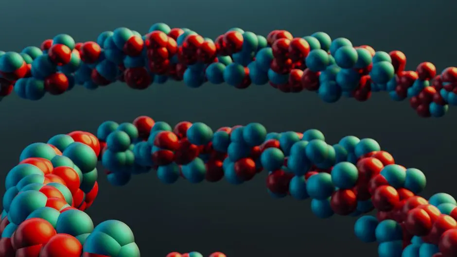
Protein function governs life's intricate machinery. Decoding the nuanced roles and relationships between proteins is paramount for advancing biology, bio-engineering, and bioinformatics. High-dimensional numerical representations, known as protein embeddings, offer a revolutionary lens, capturing intricate structural and functional properties derived from advanced AI models. These powerful embeddings condense vast biological information into quantifiable vectors, yet their inherent complexity demands sophisticated tools for interpretation.
We stand at a critical juncture: transforming these abstract numerical fingerprints into decipherable biological landscapes. This article galvanizes your Python skills to cluster and visualize protein embeddings, a surgical approach to unmask hidden relationships, pinpoint novel protein families, and accelerate discoveries in drug design and synthetic biology. By leveraging the power of AI to model protein sequences and embeddings, we gain an unprecedented ability to explore the protein universe. Prepare to forge a robust Python pipeline that transforms raw data into a visual narrative of protein diversity and function, revealing territories ripe for scientific conquest.
Activate Protein Embeddings: The Raw Data for Discovery
Protein embeddings represent a profound leap in our capacity to analyze biological sequences. These dense vector representations capture the intricate physicochemical and evolutionary properties of proteins, transcending the limitations of traditional sequence homology searches. Models like ESM-2, ProtT5, and even representations from AlphaFold distill vast structural and functional information into a numerical 'fingerprint' for each protein. This quantitative encoding allows us to compare proteins not just by their direct sequence, but by their higher-order relationships, predicting function, stability, and interaction potential with unprecedented accuracy. We activate these embeddings as the foundational data layer for all subsequent analyses.
However, the power of embeddings comes with inherent complexity: their high dimensionality. Vectors often comprise hundreds or even thousands of features, making direct interpretation or visualization impossible. Our initial task is therefore a surgical preparation: loading these raw, high-dimensional arrays into a usable format within Python. We typically encounter embeddings stored as NumPy arrays or CSV files, where each row corresponds to a protein and each column represents a feature in its embedding vector. This activation phase requires careful consideration of data scale; large datasets demand efficient memory management and potentially parallel processing. The provided Python code demonstrates how to generate a dummy dataset that mimics real-world embeddings, setting the stage for the transformative steps ahead. This robust data foundation is the bedrock upon which we shall build our pipeline to uncover latent biological associations, predict function, or identify novel protein variants.
import numpy as np
import pandas as pd

def generate_dummy_embeddings(num_proteins=100, embedding_dim=1024, random_seed=42):
    """
    Generates dummy protein embeddings for demonstration purposes.
    In a real scenario, these would be loaded from pre-computed files
    (e.g., ESM-2, ProtT5 embeddings).
    """
    np.random.seed(random_seed)
    # Simulate different clusters by adding distinct offsets
    embeddings = np.zeros((num_proteins, embedding_dim))

    # Cluster 1: simulate a group with certain characteristics
    embeddings[0:int(num_proteins*0.3)] = np.random.randn(int(num_proteins*0.3), embedding_dim) * 0.5 + 2
    # Cluster 2: simulate another distinct group
    embeddings[int(num_proteins*0.3):int(num_proteins*0.7)] = np.random.randn(int(num_proteins*0.4), embedding_dim) * 0.5 - 2
    # Cluster 3: simulate a third group with a unique feature in a specific dimension
    embeddings[int(num_proteins*0.7):] = np.random.randn(num_proteins - int(num_proteins*0.7), embedding_dim) * 0.5 + np.array([0, 0, 5] + [0]*(embedding_dim-3))

    protein_ids = [f"protein_{i:03d}" for i in range(num_proteins)]

    print(f"Generated {num_proteins} dummy embeddings with dimension {embedding_dim}.")
    return pd.DataFrame(embeddings, index=protein_ids)

# --- EXECUTION ---
# For a real dataset, replace this with loading your actual embeddings.
# Example: df_embeddings = pd.read_csv("path/to/your/embeddings.csv", index_col=0)
# Or: df_embeddings = pd.DataFrame(np.load("path/to/your/embeddings.npy"))

# Generate a larger dummy dataset for a more robust demonstration
df_embeddings = generate_dummy_embeddings(num_proteins=500, embedding_dim=1280) # Common embedding dimensions (e.g., ESM-2)
print("Shape of loaded embeddings:", df_embeddings.shape)
# Display a small sample to verify structure
print("\nFirst 5 embeddings (first 5 dimensions):")
print(df_embeddings.iloc[:5, :5])
Engineer Clarity: Project High-Dimensionality into Visual Space
High-dimensional data, while information-rich, fundamentally resists direct visualization. To engineer clarity, we deploy dimensionality reduction techniques, meticulously projecting intricate protein relationships into two or three dimensions. Principal Component Analysis (PCA) serves as our initial, linear assault, identifying orthogonal directions of maximum variance. While PCA reveals dominant global trends and effectively reduces noise, it often struggles to capture the complex, non-linear manifold structures inherent in biological data, where subtle shifts in features can signify profound functional differences.
For deciphering nuanced biological landscapes, we activate non-linear methods: t-Distributed Stochastic Neighbor Embedding (t-SNE) and Uniform Manifold Approximation and Projection (UMAP). UMAP emerges as our strategic advantage, offering a superior balance between preserving global data structure and local neighborhood relationships. It generally outperforms t-SNE in speed and consistency, making it ideal for larger datasets. Surgical calibration of UMAP's parameters—specifically n_neighbors and min_dist—is not arbitrary fiddling; it directly influences the resulting visual topology. A smaller n_neighbors emphasizes local clusters, potentially revealing fine-grained protein families, while a larger value unveils broader contextual separation. Similarly, a smaller min_dist allows points to be packed more densely, highlighting cluster compactness. This projection phase is a surgical strike, transforming abstract vectors into a spatial map where proximity implies similarity, setting the precise stage for pattern detection and functional hypothesis generation. We must acknowledge that this transformation is a trade-off, losing some information to gain interpretability, but the strategic application minimizes critical data loss.
import umap
from sklearn.decomposition import PCA
import matplotlib.pyplot as plt
import seaborn as sns

# Ensure df_embeddings is available from Part 1
# df_embeddings = ... (assuming it's loaded from previous step)

# --- Step 1: PCA for Initial Insight (Optional, but good for comparison) ---
print("Applying PCA for dimensionality reduction...")
# Reduce to a manageable number of components for initial insight or as a preprocessing step
pca = PCA(n_components=50, random_state=42)
embeddings_pca_50 = pca.fit_transform(df_embeddings)
print(f"PCA reduced to {embeddings_pca_50.shape[1]} components. Explained variance ratio: {pca.explained_variance_ratio_.sum():.2f}")

# --- Step 2: UMAP for 2D/3D Visualization ---
print("Applying UMAP for 2D visualization...")
# UMAP parameters are crucial for effective visualization:
# n_components: 2 for 2D, 3 for 3D visualization.
# n_neighbors: Balances local versus global structure preservation.
#              Smaller values emphasize local structure, larger values emphasize global structure.
#              A good starting point is often between 5 and 50.
# min_dist: Controls how tightly points are packed together.
#           Smaller values allow denser embeddings, larger values push points further apart.
#           Typically between 0.0 and 0.99.
umap_reducer = umap.UMAP(
    n_components=2,
    n_neighbors=15,
    min_dist=0.1,
    random_state=42,
    metric='euclidean' # Common metric, but 'cosine' can be useful for high-dimensional embeddings
)
embeddings_2d = umap_reducer.fit_transform(df_embeddings) # Fit and transform the original high-dimensional data

print("Shape of 2D UMAP embeddings:", embeddings_2d.shape)

# Create a DataFrame for easier plotting, retaining protein IDs
df_umap_2d = pd.DataFrame(embeddings_2d, columns=['UMAP_1', 'UMAP_2'], index=df_embeddings.index)
print("\nFirst 5 UMAP 2D embeddings:")
print(df_umap_2d.head())

# Optionally, uncomment and run for 3D visualization if desired
# print("\nApplying UMAP for 3D visualization...")
# umap_reducer_3d = umap.UMAP(n_components=3, n_neighbors=15, min_dist=0.1, random_state=42, metric='euclidean')
# embeddings_3d = umap_reducer_3d.fit_transform(df_embeddings)
# df_umap_3d = pd.DataFrame(embeddings_3d, columns=['UMAP_1', 'UMAP_2', 'UMAP_3'], index=df_embeddings.index)
# print("Shape of 3D UMAP embeddings:", df_umap_3d.shape)
# print("First 5 UMAP 3D embeddings:")
# print(df_umap_3d.head())
Decode Patterns: Cluster Embeddings for Functional Insights
With our protein embeddings meticulously projected into a lower-dimensional space, we activate clustering algorithms to decode hidden patterns, transforming visual proximity into functional insights. K-Means offers a rapid initial segmentation, forcing data into a predefined number of clusters, k. Selecting the optimal k is a critical decision, not a guess; we deploy methods like the Elbow Method (observing the inertia's rate of decrease) and the Silhouette Score (measuring how similar an object is to its own cluster compared to other clusters) to algorithmically validate our choice. These metrics are tools for precision, guiding us to the most stable and meaningful partitions within the data. However, K-Means assumes spherical clusters of similar sizes, a simplification often challenged by the organic complexity of biological data.
For situations where cluster boundaries are ambiguous or density varies widely, DBSCAN (Density-Based Spatial Clustering of Applications with Noise) provides a superior, surgically precise solution. DBSCAN identifies high-density regions as clusters and flags sparse regions as 'noise' or outliers (assigned a cluster label of -1). This mirrors biological reality, where not all proteins fit neatly into established families, and some might represent truly novel entities or experimental anomalies. Tuning DBSCAN's parameters, eps (the radius of a neighborhood) and min_samples (the minimum number of points required to form a dense region), is paramount. Techniques like the k-distance graph can guide eps selection. Finally, Agglomerative Hierarchical Clustering offers an alternative perspective, building a hierarchy of clusters from individual data points upward. Its visualization through dendrograms is invaluable for exploring evolutionary relationships and nested functional groups, providing a macroscopic view of the protein landscape. The choice of algorithm is a strategic decision, driven by our hypothesis about the data's underlying structure and the specific biological questions we aim to answer. We are not merely grouping points; we are uncovering potential functional groups, evolutionary branches, or structural motifs that redefine our understanding of protein families.
from sklearn.cluster import KMeans, DBSCAN, AgglomerativeClustering
from sklearn.metrics import silhouette_score
import matplotlib.pyplot as plt

# Ensure df_umap_2d is available from Part 2
# df_umap_2d = ... (assuming it's available and contains 'UMAP_1', 'UMAP_2')

# Prepare data for clustering (exclude protein_id if it was added for hover_data)
data_for_clustering = df_umap_2d[['UMAP_1', 'UMAP_2']]

# --- Step 1: K-Means Clustering ---
print("Applying K-Means clustering...")
# Determining the optimal 'k' is critical. We use the Elbow Method.

# Elbow Method to find optimal 'k' based on inertia
inertias = []
max_k = 15 # Test up to 15 clusters
for k in range(1, max_k + 1):
    kmeans_model = KMeans(n_clusters=k, random_state=42, n_init=10) # n_init for robust centroid initialization
    kmeans_model.fit(data_for_clustering)
    inertias.append(kmeans_model.inertia_)

plt.figure(figsize=(10, 6))
plt.plot(range(1, max_k + 1), inertias, marker='o', linestyle='-', color='blue')
plt.title('Elbow Method for Optimal K (K-Means)')
plt.xlabel('Number of Clusters (k)')
plt.ylabel('Inertia (Sum of squared distances)')
plt.xticks(range(1, max_k + 1))
plt.grid(True, linestyle='--', alpha=0.7)
plt.show()
print("Inspect the plot to identify the 'elbow' point. This suggests an optimal K.")

# Based on typical results for the dummy data, let's assume K=3 or K=4 for demonstration
optimal_k_kmeans = 3 # Adjust this based on your Elbow Method observation
kmeans = KMeans(n_clusters=optimal_k_kmeans, random_state=42, n_init=10)
df_umap_2d['kmeans_cluster'] = kmeans.fit_predict(data_for_clustering)
print(f"K-Means clustering performed with K={optimal_k_kmeans}. Cluster counts:\n{df_umap_2d['kmeans_cluster'].value_counts()}")

# Calculate Silhouette Score (requires at least 2 clusters) as another validation metric
if optimal_k_kmeans > 1:
    silhouette_avg = silhouette_score(data_for_clustering, df_umap_2d['kmeans_cluster'])
    print(f"K-Means Silhouette Score: {silhouette_avg:.3f} (closer to 1 is better)")

# --- Step 2: DBSCAN Clustering ---
print("\nApplying DBSCAN clustering...")
# DBSCAN parameters: eps (epsilon) and min_samples.
# 'eps' is the maximum distance between two samples for one to be considered as in the neighborhood of the other.
# 'min_samples' is the number of samples (or total weight) in a neighborhood for a point to be considered a core point.
# Tuning these is crucial; a k-distance plot can help determine 'eps'.
# For this example, we select values appropriate for the UMAP scale.
dbscan = DBSCAN(eps=0.5, min_samples=5) # Tune these parameters based on your data's density
df_umap_2d['dbscan_cluster'] = dbscan.fit_predict(data_for_clustering)

print(f"DBSCAN clustering performed. Cluster counts:\n{df_umap_2d['dbscan_cluster'].value_counts()}")
print("Note: Cluster label -1 represents noise points (outliers) in DBSCAN. This can be biologically insightful!")

# --- Step 3: Agglomerative Hierarchical Clustering ---
print("\nApplying Agglomerative Hierarchical Clustering...")
# Agglomerative clustering builds a hierarchy. We can specify n_clusters or analyze a dendrogram.
agg_clustering = AgglomerativeClustering(n_clusters=optimal_k_kmeans) # Use the same K for comparison
df_umap_2d['agg_cluster'] = agg_clustering.fit_predict(data_for_clustering)

print(f"Agglomerative clustering performed with {optimal_k_kmeans} clusters. Cluster counts:\n{df_umap_2d['agg_cluster'].value_counts()}")

# We will use the 'kmeans_cluster' for the next visualization step as a primary example.
Visualize Insights: Charting the Protein Functional Landscape
The ultimate leverage point in protein embedding analysis is the visualization itself. We transform abstract numerical groupings into tangible, interpretable functional landscapes. Our Python toolkit, anchored by Matplotlib and Seaborn, enables the forging of static yet powerful scatter plots, where each point represents a protein, meticulously colored by its assigned cluster. We must employ best practices: distinctive, colorblind-friendly palettes for clusters, clear axis labels (even for reduced dimensions), and legible legends ensure immediate comprehension. These static visualizations provide a foundational overview, revealing macro-level patterns and separations.
For dynamic exploration, we deploy Plotly, activating a new dimension of discovery. Interactive plots transcend passive observation, transforming it into active exploration. Users gain the power to zoom into dense regions, pan across the landscape, and hover to reveal crucial protein IDs, functional annotations, or experimental metadata. This capability is not merely aesthetic; it's a critical engine for hypothesis generation. When we overlay known protein annotations, structural data, or even evolutionary histories onto these interactive maps, we instantly validate computational findings and spark novel biological hypotheses. Proximity on the map implies functional or structural similarity, while isolated clusters or outliers pinpoint potential novel functions, unique evolutionary branches, or even targets for therapeutic intervention.
However, we must guard against misinterpretation. Visual clusters can sometimes be artifacts of the dimensionality reduction or clustering parameters. Rigorous validation against orthogonal biological data (e.g., sequence motifs, structural domains, experimental assays) is paramount. We are not just creating elegant graphs; we are forging a visual language to communicate complex biological insights, allowing us to pinpoint outliers, validate functional predictions, and chart territories ripe for further experimental conquest. This charting phase activates a new frontier in biological understanding, moving us from raw data to actionable knowledge.
import matplotlib.pyplot as plt
import seaborn as sns
import plotly.express as px

# Ensure df_umap_2d with clustering results (e.g., 'kmeans_cluster') is available from Part 3
# df_umap_2d = ... (assuming it's available and contains 'kmeans_cluster', 'UMAP_1', 'UMAP_2')

# --- Step 1: Static Visualization with Matplotlib/Seaborn ---
print("Generating static plot with Matplotlib/Seaborn...")
plt.figure(figsize=(12, 10)) # Adjust figure size for better readability
sns.scatterplot(
    x='UMAP_1',
    y='UMAP_2',
    hue='kmeans_cluster',   # Color by K-Means cluster. Replace with 'dbscan_cluster' or 'agg_cluster' as needed.
    palette='viridis',      # Choose a perceptually uniform color palette
    data=df_umap_2d,
    s=60,                   # Size of points for better visibility
    alpha=0.8,              # Transparency for overlapping points
    edgecolor='w',          # White edge around points for definition
    linewidth=0.5           # Line width of the edge
)
plt.title('Protein Embeddings Clustered by K-Means (UMAP 2D)', fontsize=16)
plt.xlabel('UMAP Dimension 1', fontsize=14)
plt.ylabel('UMAP Dimension 2', fontsize=14)
plt.legend(title='Cluster', bbox_to_anchor=(1.05, 1), loc='upper left', borderaxespad=0.) # Move legend outside plot
plt.grid(True, linestyle='--', alpha=0.6)
plt.tight_layout() # Adjust layout to prevent labels/legend from overlapping
plt.show()

# --- Step 2: Interactive Visualization with Plotly Express ---
print("\nGenerating interactive plot with Plotly Express...")
# Add protein_ids to the DataFrame for hover information, if not already present
if 'protein_id' not in df_umap_2d.columns:
    df_umap_2d['protein_id'] = df_umap_2d.index

# Ensure the cluster column is treated as a categorical variable for distinct colors
df_umap_2d['kmeans_cluster_str'] = df_umap_2d['kmeans_cluster'].astype(str)

fig = px.scatter(
    df_umap_2d,
    x='UMAP_1',
    y='UMAP_2',
    color='kmeans_cluster_str', # Color by K-Means cluster (as string for discrete colors)
    hover_data=['protein_id', 'kmeans_cluster_str'], # Show protein ID and cluster on hover
    title='Interactive Protein Embedding Clusters (UMAP 2D)',
    labels={'UMAP_1': 'UMAP Dimension 1', 'UMAP_2': 'UMAP Dimension 2', 'kmeans_cluster_str': 'K-Means Cluster'},
    color_discrete_sequence=px.colors.qualitative.Plotly # Use a qualitative palette for distinct clusters
)

fig.update_layout(
    margin=dict(l=40, r=40, b=40, t=60),
    plot_bgcolor='white',
    paper_bgcolor='white',
    font=dict(family="Arial", size=12, color="black"),
    hoverlabel=dict(bgcolor="white", font_size=12, font_family="Arial")
)
fig.update_traces(marker=dict(size=10, opacity=0.8, line=dict(width=1, color='DarkSlateGrey')),
                  selector=dict(mode='markers'))

fig.show()

print("Interactive plot displayed. Leverage zoom, pan, and hover functionalities for deep data exploration.")
print("To enrich discoveries, integrate known biological annotations (e.g., protein family, domain, experimental data) into 'hover_data'.")
Key Takeaways
Protein Embeddings: Foundation for Discovery
Protein embeddings, high-dimensional vectors derived from advanced AI models, quantify functional and structural similarities far beyond conventional sequence homology. They serve as the numerical bedrock, condensing vast biological information into actionable data for advanced biological insights and pattern discovery.
Dimensionality Reduction: Unlocking Visual Insights
PCA provides foundational linear insights into protein data. However, UMAP (Uniform Manifold Approximation and Projection) is paramount for surgically projecting complex, non-linear protein relationships into an interpretable 2D/3D space, balancing the preservation of global structure with local detail. Careful parameter calibration is essential.
Clustering: Decoding Hidden Biological Architecture
K-Means offers rapid initial grouping, with optimal 'k' guided by metrics like the Elbow Method. DBSCAN surgically identifies dense clusters and isolates noise, revealing natural groupings without predefined counts, ideal for discovering arbitrary shapes. Agglomerative clustering maps hierarchical relationships. The strategic choice of algorithm is dictated by the specific biological question.
Visualization: Activating Interpretability & Discovery
Static plots (Matplotlib/Seaborn) provide initial views. Interactive plots (Plotly) activate deeper exploration by revealing protein metadata on demand, enabling zooming and panning. This dynamic approach is crucial for validating hypotheses, identifying outliers, and charting new biological territories for further investigation and experimental conquest.
Iterative Refinement & Validation: The Expert Approach
Effective protein embedding analysis is an iterative process. Continually calibrate dimensionality reduction and clustering parameters, rigorously validate computational findings against known biological data, and actively seek novel interpretations where derived clusters diverge from existing annotations. This iterative refinement transforms raw data into high-value biological intelligence.
FAQ
-
Why can't I just use sequence alignment for protein pattern discovery?
While sequence alignment remains a powerful tool for identifying homologous proteins, it primarily focuses on direct amino acid similarity. It struggles profoundly with remote homologs, proteins that share similar structures and functions but possess low sequence identity due to evolutionary divergence. Protein embeddings, conversely, capture subtler, high-order physicochemical and evolutionary relationships across entire protein sequences, allowing for discovery of functional similarity driven by conserved structural folds or interaction interfaces rather than direct sequence identity. Embeddings offer a more holistic and robust representation for detecting nuanced biological patterns.
-
How do I choose the best dimensionality reduction technique for protein embeddings?
The optimal choice depends on your specific biological question and data characteristics. PCA (Principal Component Analysis) is excellent for initial linear insights, explaining variance and reducing noise, especially useful when preserving global variance is paramount. However, for revealing intricate, non-linear protein relationships, UMAP (Uniform Manifold Approximation and Projection) is often superior. UMAP excels at preserving both local neighborhood structures and global data topology, making it ideal for visualizing complex biological data. t-SNE (t-Distributed Stochastic Neighbor Embedding) also handles non-linearity but can be slower and more sensitive to parameter choices, often distorting global structure more than UMAP. We recommend commencing with UMAP for its efficiency and balanced preservation of data structure.
-
What if my discovered protein clusters don't align with known biological functions or families?
This is not a failure; it's a profound opportunity for discovery! When computational clusters diverge from existing annotations, it indicates potentially novel functional classes, previously unappreciated evolutionary divergence, or even errors or incompleteness in current biological knowledge. This requires iterative investigation: Validate these novel clusters with orthogonal data sources such as structural predictions, known protein interaction networks, or literature reviews. Design targeted experimental validations to confirm predicted functions or interactions. This discrepancy is a leverage point for expanding our understanding of protein biology, not a signal to discard your findings.