
> Laboratory Techniques > Laboratory Data Processing and Experiment Analysis > Forge Impactful Lab Reports: Best Charts for Data Presentation
Forge Impactful Lab Reports: Best Charts for Data Presentation
In the high-stakes arena of biological research, raw data, however meticulously gathered, remains inert without effective communication. The power to transform complex experimental outcomes into clear, compelling narratives rests heavily on our choice of data visualization. A well-selected chart transcends mere aesthetics; it becomes a critical instrument for uncovering patterns, highlighting significance, and driving scientific discourse.
This resource carves a strategic path through the landscape of data visualization, empowering you to select the optimal charts that not only accurately represent your findings but also amplify their impact. We will dissect the strengths and weaknesses of various chart types, revealing how to avoid common pitfalls and harness best practices to elevate your scientific storytelling. Prepare to unlock the full potential of your lab results, making every data point count and every conclusion unmistakable. This mastery is paramount for effectively analyzing and interpreting experimental data in biology labs, ensuring your research resonates with precision and authority.

Mastering the Fundamentals: The Core Principles of Effective Data Visualization in Labs
Before we delve into specific chart types, we must engrave the foundational principles of effective data visualization. We visualize data not merely to display it, but to illuminate insights, confirm or refute hypotheses, and communicate complex information with clarity and precision. The primary objective is always to tell the data's story accurately and compellingly, ensuring the audience grasps the key message without ambiguity. We confront a common challenge: the temptation to choose a chart based on familiarity rather than suitability. This often leads to misleading representations or obscured findings.
A critical first step involves a deep understanding of your data's nature: Is it categorical, ordinal, continuous, or discrete? What relationships are we aiming to illustrate—comparison, distribution, trend, correlation, or composition? Each data type and relationship demands a specific visual strategy. We also prioritize simplicity and directness. Avoid chart junk—any extraneous elements that do not convey information but only distract. We ensure labels are clear, axes are properly scaled, and legends are intuitive. The goal is to minimize cognitive load on the reader, allowing them to focus entirely on the scientific message. By embracing these principles, we lay a robust groundwork for selecting charts that genuinely serve our experimental narrative.
Categorical and Comparative Analysis: Bar Charts, Grouped Bars, and Box Plots
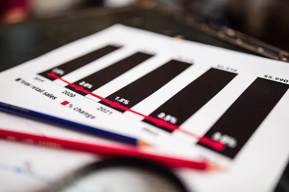
When our objective is to compare discrete categories or analyze the distribution of numerical data across these categories, specific chart types emerge as indispensable tools. Bar charts are foundational for displaying and comparing quantities of different categories. We deploy them when comparing mean values, frequencies, or percentages across groups. For instance, comparing growth rates of bacteria under different antibiotic treatments is a classic application. We can enhance them with error bars to represent variability, a crucial aspect in biological data.
For more nuanced comparisons involving multiple sub-categories or conditions within each main category, grouped bar charts prove invaluable. Imagine comparing the expression levels of several genes across various tissue types. However, we must exercise caution: too many groups can lead to visual clutter, hindering interpretation. An alternative for exploring the distribution and spread of data within categories is the box plot (boxplot). This powerful visualization compactly displays the median, quartiles, and potential outliers, offering a quick yet profound insight into data variability and skewness. For instance, comparing enzyme activity distributions across different pH levels, including potential outliers, makes box plots superior to simple bar charts of means. These charts collectively empower us to make robust, evidence-based comparisons and identify significant differences.
Revealing Relationships and Trends: Scatter Plots, Line Graphs, and Heatmaps
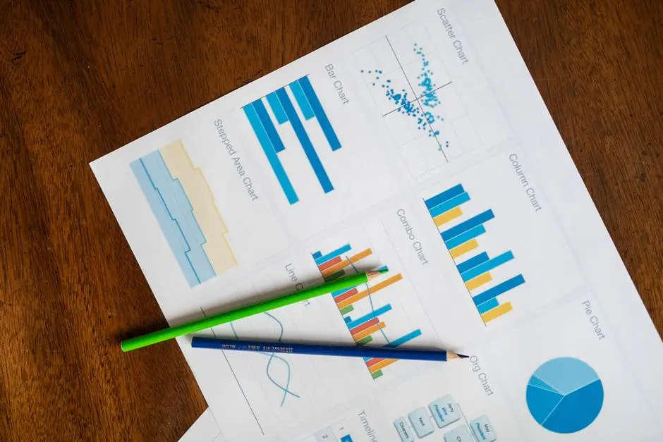
Uncovering the intricate relationships between continuous variables or tracking changes over time demands specialized visualization techniques. Scatter plots stand as the prime choice for illustrating the correlation or relationship between two continuous variables. For example, plotting drug concentration against its effect on cell viability clearly reveals dose-response relationships. The density of points, their directionality, and the presence of any discernible patterns immediately communicate insights into positive, negative, or absent correlations. We can augment these with regression lines to quantify and visualize the trend, along with confidence intervals to assess the reliability of the fit.
When we track data over a continuous range, typically time or an ordered sequence, line graphs become our ally. They excel at showcasing trends, patterns, and fluctuations. Monitoring bacterial population growth over several hours or observing changes in protein concentration during an experiment are perfect scenarios for line graphs. Plotting multiple lines on a single graph allows for direct comparison of trends across different experimental conditions, provided clarity is maintained through distinct colors and markers. For high-dimensional datasets, particularly in genomics or proteomics, heatmaps offer a compelling visual summary. They use color intensity to represent magnitudes, often illustrating gene expression patterns across samples or protein-protein interaction strengths. Heatmaps allow us to spot clusters and patterns that might be invisible in tabular data, transforming complex matrices into intuitive visual landscapes.

Understanding Distributions and Composition: Histograms, Density Plots, and Strategic Pie Chart Use
To comprehend the distribution of a single continuous variable or to illustrate the composition of a whole, we turn to another set of powerful visualization tools. Histograms are indispensable for visualizing the frequency distribution of continuous numerical data. By dividing data into 'bins' and counting the number of observations in each bin, we gain a clear picture of the data's shape, center, spread, and skewness. For instance, analyzing the distribution of cell sizes in a population or reaction times under specific stimuli requires a histogram. The choice of bin width is crucial; too narrow, and we get noise; too wide, and we lose detail. We experiment to find the optimal binning that best reveals the underlying data structure.
An elegant alternative to histograms, especially for smoother representations of distributions, is the density plot (kernel density estimate). It provides a continuous curve that estimates the probability density function of the data, often overlaid to compare distributions across multiple groups without the binning challenges of histograms. For compositional data—parts of a whole—pie charts are frequently used, but often misused. They are best reserved for a very limited number of categories (ideally 2-4) where the differences in proportion are substantial and easily discernible. For instance, depicting the major components of a biological sample (e.g., DNA, RNA, protein) in a high-level overview. For more than a few categories or for subtle differences, stacked bar charts or donut charts with clear labels offer superior readability, as comparing segment areas in a pie chart is cognitively challenging for the human eye. We prioritize clarity over tradition, choosing the chart that genuinely conveys proportions effectively.

Advanced Techniques and Ethical Considerations: Elevating Lab Data Presentation
Beyond the fundamental chart types, the realm of biological data offers opportunities for more sophisticated visualizations that can extract deeper insights. For complex multi-variable relationships or hierarchical data, techniques like violin plots (which combine aspects of box plots and density plots to show full data distribution) or dendrograms (for clustering results in genomics/proteomics) can be transformative. Heatmaps with hierarchical clustering are particularly powerful for visualizing patterns in gene expression data across samples and genes simultaneously. We must also explore specialized plots for specific domains, such as circos plots for genomic rearrangements or network graphs for visualizing protein-protein interactions. The key is to match the complexity of the visualization to the complexity of the data and the question we aim to answer, always ensuring interpretability.
Crucially, our commitment extends to the ethical presentation of data. We meticulously avoid any practices that could mislead, exaggerate, or obscure actual findings. This includes choosing appropriate scales, not truncating axes to inflate differences, and clearly labeling all elements. Color choice, for instance, must be considered not just for aesthetics but for accessibility (e.g., colorblind-friendly palettes) and to avoid inducing false perceptions. Annotations—textual explanations, arrows, and highlights—are vital for guiding the viewer to the most critical information without ambiguity. We embrace the iterative process of visualization: draft, review, refine. By integrating advanced techniques with unwavering ethical standards, we elevate our lab data presentation from mere display to compelling, trustworthy scientific communication that stands up to rigorous scrutiny.
Key Takeaways
Fundamental Principles for Impactful Visualization
We prioritize clarity, accuracy, and impact. Understand data type and message (comparison, trend, distribution, correlation, composition). Eliminate 'chart junk' and ensure clear labels, proper scaling, and intuitive legends. The goal is to minimize cognitive load and tell the data's story without ambiguity.
Strategic Chart Selection for Data Types
- Categorical/Comparative: Use Bar Charts (for comparing quantities, means, frequencies) and Box Plots (for showing data distribution, median, quartiles, outliers across categories). Grouped bar charts help with sub-categories, but avoid clutter.
- Relationships/Trends: Employ Scatter Plots (for correlations between two continuous variables), Line Graphs (for trends over time or ordered sequences), and Heatmaps (for high-dimensional data patterns like gene expression).
- Distributions/Composition: Utilize Histograms (for frequency distribution of a single continuous variable) and Density Plots (for smoother distribution estimates). Use Pie Charts sparingly for 2-4 distinct categories; prefer stacked bar charts for more complex compositional data.
Advanced Techniques and Ethical Presentation
Explore Violin Plots (full distribution insight), Dendrograms, and Network Graphs for complex datasets. Adhere to ethical practices: use appropriate scales, avoid truncated axes, and select accessible color palettes. Always annotate clearly and iteratively refine visualizations for maximum clarity and trustworthiness.
FAQ
-
How do I choose the most appropriate chart for my biological lab results?
To select the most appropriate chart, we first identify the type of data we are working with (e.g., categorical, continuous, ordinal). Next, we define the message we intend to convey: are we comparing groups, showing a trend over time, illustrating a distribution, demonstrating a correlation, or highlighting composition? For instance, to compare means across categories, we deploy bar charts; for trends over time, line graphs; for showing relationships between two continuous variables, scatter plots; for distributions, histograms or box plots; and for parts of a whole, strategically chosen pie or stacked bar charts. Always prioritize clarity and accuracy over visual flair.
-
What are common pitfalls to avoid when presenting lab data with charts?
We must rigorously avoid several common pitfalls that can undermine the integrity and clarity of our charts. A primary error is selecting the wrong chart type for the data or message. Other significant missteps include using truncated axes to exaggerate differences, employing overly complex or 'chart junk' elements that distract from the data, and using misleading color scales. Inadequate labeling of axes, legends, and data points also impedes understanding. We also ensure that error bars are correctly applied and interpreted. By proactively addressing these issues, we uphold the scientific rigor of our data visualizations.